According to the Merriam-Webster dictionary, a diptych /ˈdɪptɪk/ is:
1. a 2-leaved hinged tablet folding together to protect writing on its waxed surfaces;
2. a picture or series of pictures (as an altarpiece) painted or carved on two hinged tablets; or
3. a work made up of two matching parts.
I love making diptychs of the latter kind.
It’s striking how one is able to convey more using a pair of well-chosen images instead of two pictures as separate entities. That’s the beauty of diptychs, with their enhanced potential for storytelling.
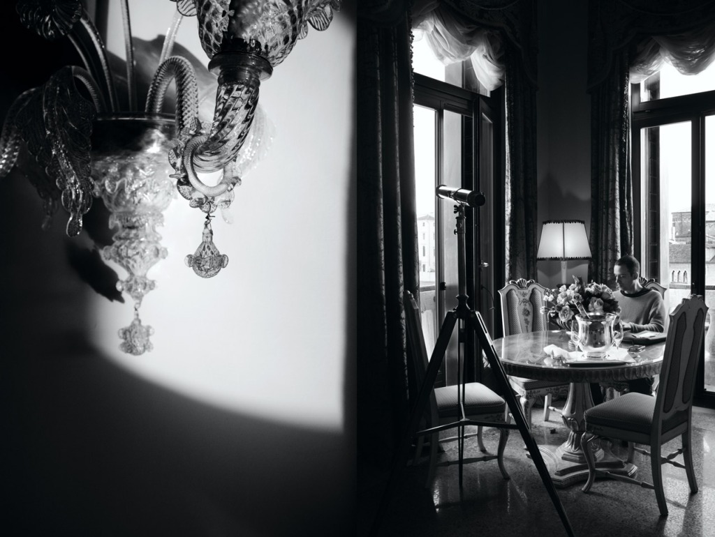
For instance, this monochrome diptych features the living room of the Punta della Dogana Suite and a close-up of a Murano lamp in the room. I like how the light falls and the different textures in these two photos, as well as the elevated sense of tranquility and grace shown in this combination.

The following diptych, featured in “Postcards from Italy“, was also taken in the Punta della Dogana Suite. Aside from the obvious colour difference between the two diptychs, I think that each pairing tell a different story.
I feel that the monochrome diptych depicts a scene of timeless elegance while the latter is about a journey. What do you think?

Some diptychs show different perspectives of the same scene or setting. What I like about diptychs is that you can provide more information about an experience through a thoughtful pairing.
For instance, these two photos were taken along a disused train track in Charleroi. While they look fine on their own, I find that the visual impact is significantly increased when they are placed side by side. I like the juxtaposition of the wide shot of the abandoned factory against the close-up image of the train tracks.

Recently, I started making diptychs combining pictures taken by AB and I. It’s interesting to see how each of us views what’s around us, as well as mix things up a bit with our photographic styles.
This pair of photos was taken at La Caféothèque and featured in a recent post on “No Shitty Coffee in Paris“. While the two photos were taken about six months apart, I thought they came together nicely.
By the way, both were taken with AB’s Voigtlander Bessa rangefinder: One with Kodak Tx 400, the other with Solaris 400.

The diptych below features photos that we took in Charleroi: One of Nicolas and I catching our breath on top of a slag heap – taken by AB who had used his red filter after mistakenly loading colour film into his camera. The other is a silhouette shot of AB and Enrico chatting in the dark depths of a never-been-used metro station.

How the pictures are placed next to each other makes a difference too. Sometimes I can’t make up my mind. I would switch the order of the photos back and forth, left and right, and top and bottom, before asking for AB’s input after minutes of deliberation.
This pair of photos – taken outside a disused cooling plant in Charleroi, works better in this arrangement than the other way round. If I were to have placed the flower shot on the left instead, the lines of the overhead pipes would have appeared (too) harmoniously joined together.

I find that diptychs work well for food shots too. Here are two examples.
First up, tasty tapas with a modern twist at Eslava @ 3 calle Eslava in Seville. My favourite was the scallops served atop seaweed puree and kataifi noodles.

The only thing in common between the two pictures below is that they were taken in Hokkaido . While there’s no direct relation between them, I find that the pairing works well and is pleasing on the eye. Why exactly, I don’t know. It just does!

Famous diptychs in the art and religious worlds include:
- Double portraits of the Duke and Duchess of Urbino by Piero della Francesca during the Italian Renaissance
- The Wilton Diptych, artist unknown, late 14th century
- Marilyn Diptych by Andy Warhol in 1962, shortly after the Hollywood star died
- 99 Cent II Diptychon by Andreas Gursky sold for a record US$3.34 million in 2007 at a Sotheby’s auction, making it the most expensive photograph

Join the Conversation