One of the first things I did when I swopped my Blackberry for an iPhone was to download Instagram.
My Instagram account @angelinahue is a condensed, visual reflection of my blog.
It’s a mix of architectural and landscape shots from my travels, plus an occasional picture of cats, books or food. There’s plenty of colour and geometry alongside monochrome street shots.

I recently came across some recommendations from people who have a huge following on Instagram on how to build one’s brand and presence on this increasingly popular social media platform.
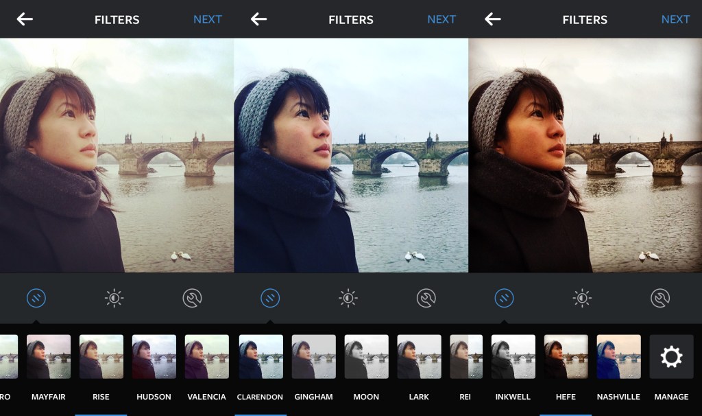
One of the recurring tips was to create a consistent theme on Instagram. To achieve this, you could focus on a regular subject matter, have a certain photo composition style, or using the same filter so that your Instagram gallery has a uniform look.
While I understand the rationale for such consistency, I’d find this hard to follow. Plus I’d be bored if I were to adhere to one standard way of creating visual content. In particular, applying the same filter onto all my images.
Don’t get me wrong, there are many photographers whose works I admire who have a consistent look to their photos – either because of the film they use or their photo editing process.
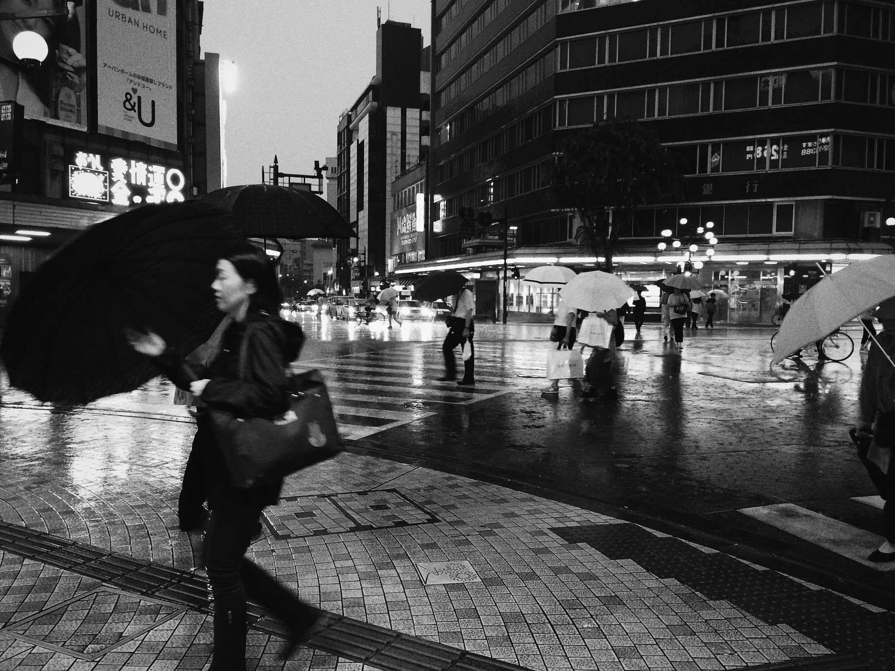
While I take more photos in colour than in black and white, some images simply work better in monochrome and evoke a certain ambiance that would not have been possible in colour. Rendering a photo in black and white can transform the subject of focus in an image, removing ‘distractions’ that would have been prominent in colour.
Similarly with colour images, the stories or mood that I want to create will not work if I were to use the same filter for all my pictures. Plus I use different software to edit my photos depending on the camera that I took them with, so the output would inevitably be different anyway.
For instance, I use RPP to process the raw files taken with my Fuji x100 and Photoshop for the digital scans of film photos.
For photos taken with my phone, I use VSCO Cam. While I use a lot of the S2 preset for its bright, clean look, my favourite filter is HB1 – jointly created by Hypebeast and VSCO – as I love the cool tones which sometimes add a moodiness to my picture


Nonetheless, it was interesting to read about the studies that investigated which Instagram filters drive more engagement from the social media community. According to a research at Yahoo Labs, “filtered photos are 21 percent more likely to be viewed and 45 percent more likely to be commented on.”
Other studies show that people seem to prefer images that have a warmer temperature, bright exposure and higher contrast. Which explains the popularity of Instagram filters such as Mayfair, Rise and X-Pro II.
For my Instagram account @angelinahue, I am going to keep to my current approach, editing each photo as I deem necessary rather than trying to fit the different pictures into one consistent look.
If you are on Instagram, how do you decide what images to post on it?
What is your approach towards photo editing? Do you have a preferred photo editing tool, filter or methodology?

Join the Conversation