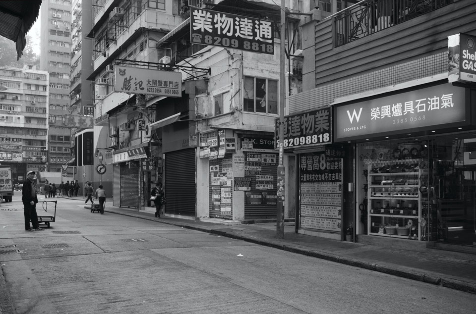
This is not a review about the W Hong Kong hotel in Kowloon. Rather, this is a question that I’m thinking about out loud – does this photo look better in colour or black and white? For me, it would be the latter because the “W Stoves & LPG” pops out more than in the latter, and this is my focus in the image. I had spotted this copycat logo while we were walking on a perpendicular street to this. I find it quite amusing that the shop was selling stoves and liquified petroleum gas. W hotels are known to be trendy and cool, the place to see and be seen. The owner of the shop must be a big W fan for I cannot see any other reason why he or she would want to copy the W logo as I don’t think it would help sell more stoves or LPG canisters!
 By the way, I hear that the W Hong Kong has a rooftop pool with impressive views.
Around the World | Art + Design | Books | Food | Musings | Photography
W in Hong Kong
This is not a review about the W Hong Kong hotel in Kowloon. Rather, this is a question that I’m thinking about out loud – does this photo look better in colour or black and white? For me, it would be the latter because the “W Stoves & LPG” pops out more than in the latter,…
Responses to “W in Hong Kong”
-
-
I think colour, the signs on this photo want to be noticed 🙂 I stayed at the W once and yes, the pool’s awesome. Although honestly, their bar in the lobby’s better.
LikeLike

Join the Conversation